So you want to write a resume for yourself, but you’re not sure how to format it. What is the most popular resume format in 2025? Which resume format do recruiters like to see? You feel like making one wrong step can cost you that interview.
Maybe you came here to double-check which of the three standard resume formats you should pick. Maybe you want to learn about the basics of resume styling, layout, and typography. Either way, we’ve got you covered.
In this article, you’ll learn:
- How to pick the best resume format (reverse chronological, functional, combination)
- How to format a resume in terms of design and layout: which fonts to pair, what font size to use, how to set margins, and so on
- How to format a resume in terms of the structure: which sections to include, the order of sections, and how much information to provide
- Which file format to use when saving a resume (PDF, DOC, DOCX, etc.)
You’ll end up with an eye-catching, professionally formatted resume that will make you look good in the eyes of recruiters and hiring managers.
The Three Main Resume Formats
There are three standard resume formats, each highlighting a different set of your biggest achievements.
You can choose between them based on several factors: the type of job you’re applying for, the industry, and your work experience. The three resume formats are:
- Reverse chronological resume format
- Functional (or skills-based) resume format
- Combination resume format
Let’s take a look at some resume examples.
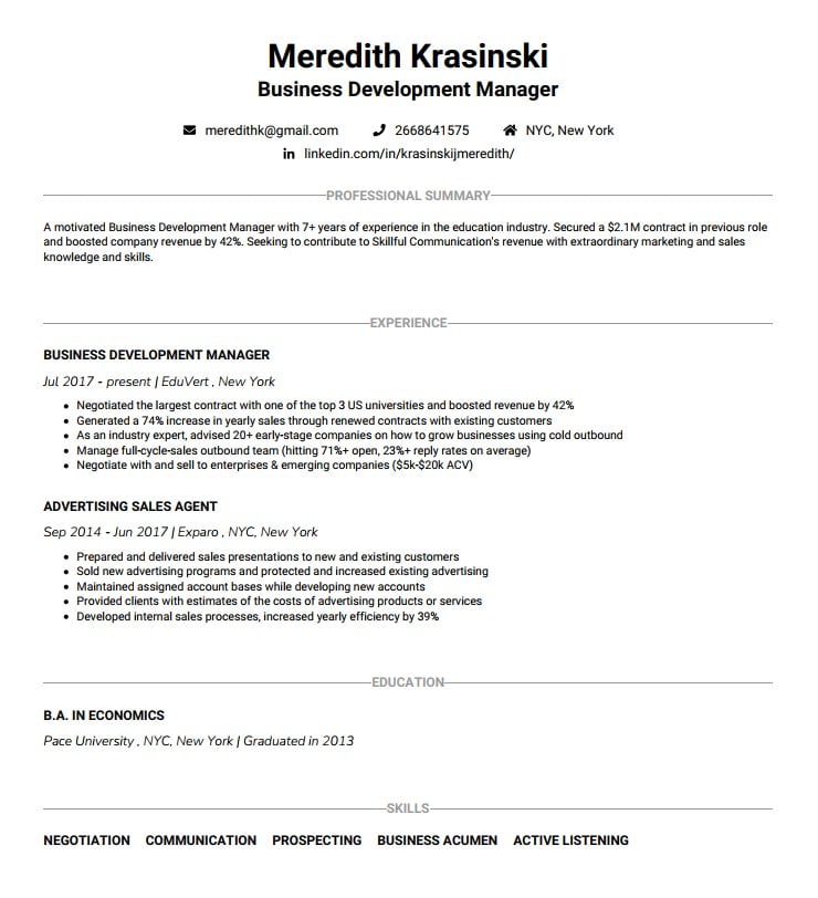
Reverse chronological resume sample
Functional resume sample

Combination (hybrid) resume sample
You’ve seen pitch-perfect examples of resumes written in each of the standard formats. Now, see which one suits your current career situation best.
Reverse chronological resume format
The key area of focus in this resume format is your work history section. You list your work experience in reverse chronological order, beginning with your current or most recent position, followed by the one before it, then another one, and so on.
This format is the safest (and usually the best) pick for virtually any candidate. You’ll find out why in a moment.
Here’s an example of the reverse chronological resume format:
Why the reverse chronological resume format is the best
This is, by far, the most common resume format. In addition, in 95% of cases, it’ll be the best format for you. This is because:
1. Recruiters are familiar with it.
And they really like it! The reverse chronological resume highlights what matters the most for recruiters. It makes their job easier because it takes them less time to spot your key skills and accomplishments. Plus, from a purely psychological point of view, humans love familiarity because it means comfort. Therefore, using a familiar resume format might increase your chances with recruiters.
2. It highlights your best achievements.
Your work experience and achievements are often key things that recruiters search for in a resume. This resume format makes them readily available in the top third of your resume, showcasing just how successful you are.
3. It’s ATS-friendly.
A lot of companies use Applicant Tracking Systems (ATS) — a software that scans your resume and looks for key information before any human lays eyes on it. Consider it a pre-step in recruiting. If you don’t pass it, a recruiter will never get the chance to check out your resume and you’ll never land an interview. That’s why it’s best practice to use a reverse chronological resume, as ATS is “used to it” and it’ll increase your chances of getting noticed.
Sections to include in a reverse chronological resume
Here’s what you need to include in your reverse chronological resume format, in this exact order:
1. Contact information
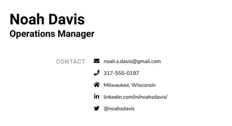
Here’s where your name goes, along with your email address, phone number, location, LinkedIn URL, and optionally other information such as a blog, portfolio, or relevant social media. You can also include your job title below your name, but it’s optional.
Don’t add your photo and date of birth (in most countries it’s frowned upon, in the US it’s plain illegal).
Additionally, use a professional email address containing only your name and surname, and make sure there are no typos in your email address and phone number.

2. Resume summary or resume objective
Summarize the most important information about yourself in 2–4 sentences. Include your role and years of experience, key accomplishments and skills, and what you can bring to the table. If you don’t have a lot of experience, focus on your transferable skills, education, certifications, and the desired goal (again, with a focus on what you bring to the table). If you’re a student, learn how to acquire skills for your resume.


3. Work experience
Without a doubt, this is the key section.
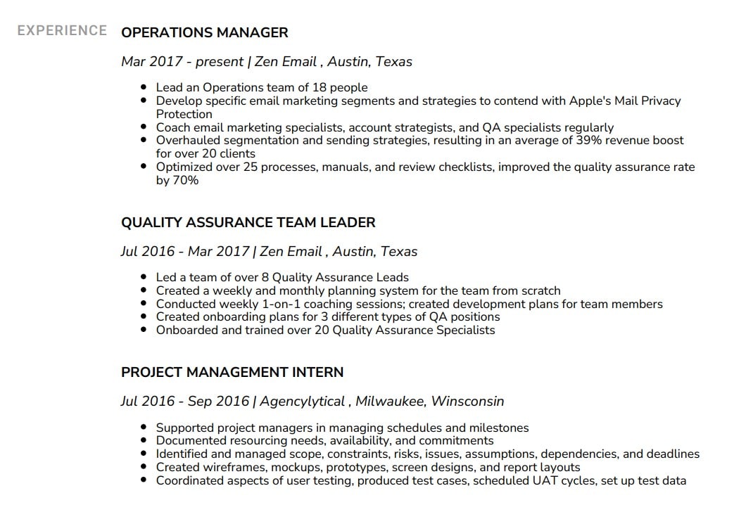
Here, try to focus on achievements rather than duties. List your positions in reverse chronological order and format it like this:
- Job title
- Company name and location
- Employment dates
- Main responsibilities (list them in bullet points and make sure you list key achievements, both qualitative and quantitative)
- For your current or most recent position, include up to 7 bullet points
- As you go back in time, limit the number of bullets per entry
For more details and a ton of examples, see our article: Work Experience on a Resume.
4. Education
Start with your highest degree. If you have a bachelor’s degree, there’s no need to list high school. If you have an MA or an MSc, list it alongside your bachelor’s.
If you have little experience, feel free to place the education section at the top, before the work history section. Here is how to format this section:
- Include your degree, field of study, and major
- University name and location
- Years attended
- GPA (only if 3.5 or higher)
- Awards and honors (if any)


For a super-detailed guide on how to list education on a resume (and a ton of examples and templates to copy), check out this article: Education Section on a Resume: How to Structure It for Greatest Impact.
5. Skills
Don’t disregard this section just because you think that work experience and education are more important. Listing your hard and soft skills on a resume can make you stand out, as they are a testament to why you’d be a great fit for a certain position.
Figure out what skills are needed for the position you are applying for and then include them in case you have them. You’ll want to list them in bullet points, as single items.
Obviously, don’t list skills you know you don’t have. Recruiters are trained to spot resume liars. They will find out.
For more info on why resume skills matter and what the best hard and soft skill combos are, check out Which Skills to Put on a Resume, no matter your job and industry.
6. Additional sections (optional)
This is a place for you to list all the things that can prove your worth and set you apart from the competition. Think awards, certificates, conferences, projects, publications, volunteer work (especially if you’re a recent grad!), languages, and hobbies. Spice it up!
Listing these is great because they show your personality and values, how you spend your free time, if you’re a lifelong learner, what skills you develop through your hobbies, and much more.
For more details on what to include in these sections, take a look at our How to Write a Resume article — it’s full of useful tips and examples.
Reverse chronological resume format: pros and cons
Pros:
- ATS-friendly
- Recruiters are familiar with it
- It highlights the biggest successes in your career so far
- It’s easy to skim and pick up the key points quickly
Cons:
- Employment gaps are noticeable immediately
- Not ideal for career changers
- If you don’t have a lot of experience, it might be hard to fill out
- It’s very common so it might be harder to stand out
Functional resume format
This type of resume format focuses on your skills rather than your experience. If you’re applying for a highly creative position and your portfolio is more important than your resume, you could pull the functional resume format off.
In all other cases, this is usually the worst option you can choose, as it’s not particularly liked by recruiters, it’s not ATS-friendly, it can conceal the most important information about you and your experience, and it might make you look like you’re trying to hide something.
However, we don’t do discrimination here at Big Interview, and that’s why we’re going to lay out all the functional resume format details for you. 😉
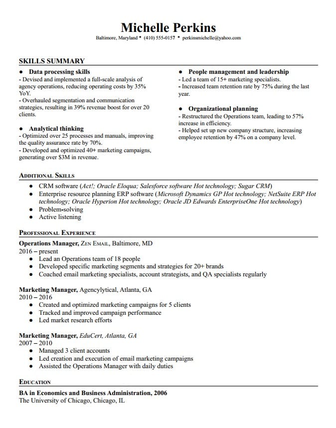
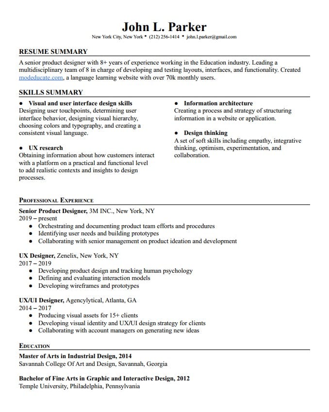
Here’s a functional resume example.
Sections to include using the functional resume format
The main principles remain the same as for the reverse chronological resume format, but there are slight twists.
Here’s what to include in a functional resume format:
1. Contact information
Include the basics here: first and last name, phone number, location, email address, LinkedIn URL. You can also add (although it’s optional) the following: portfolio, blog, social media with content relevant to the position… (Remember that you shouldn’t add your headshot and date of birth.)
2. Resume summary or resume objective
In 2–4 sentences, include your role and years of experience, key accomplishments and skills, and how you can contribute to the company you’re applying to. In case you’re inexperienced, focus on your education, desired goal (how you can contribute), certifications, or (transferable) skills.
3. Skills summary
This is the most important section in the functional resume format! Think of this as the main things you’re bringing to the table, the key skills that are guaranteed to make you successful in the position and “sell you” to the recruiter.
Make sure to carefully pick out key hard and soft skills relevant to the position.

Above, you can see a bad example of the skills summary section in the functional resume format for the position of Product Designer. The candidate listed the skills without elaborating on each; in addition, the skills listed here are not specific enough and don’t provide the full picture of this person’s abilities.
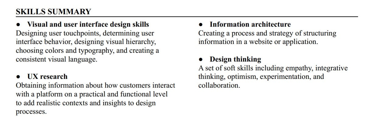
Below, you’ll see a good example of the same section for the same position. The candidate picked out key hard and soft skills, elaborating on each. This way, a recruiter will be able to see that the candidate is experienced and suitable for the position.
4. Work experience
List your positions in reverse chronological order and format them in this order:
- Job title, company name, and location
- Employment dates
- Main responsibilities (in bullet points; list crucial achievements, both qualitative and quantitative). If you don’t have relevant work experience, include volunteer work here, as well as internships.
5. Education
List your highest degree first. Then, go back in reverse chronological order. If you have a BA or a BSc, don’t list high school. If you have an MA or an MSc, list both your master’s and bachelor’s.
Here is how to format this section. Include your:
- Degree, field of study, and major
- University name and location
- Years attended
- GPA (only if 3.5 or higher)
- Awards and honors (if any)
Functional resume format: pros and cons
Pros:
- Good for highly creative candidates and positions, as well as freelancers
- Good for highlighting transferable skills
Cons:
- Difficult to quickly scan
- Disliked by recruiters
Combination resume format
As the name suggests, the combination resume format is a combination of reverse chronological and functional resume formats.
In theory, it’s awesome and tempting, because it highlights your experience and skills and validates them immediately.
But in practice, it’s really hard to pull off because it’s suitable only for highly experienced candidates.
Still, if you have a lot of experience and you’re fairly sure the company you’re applying to is not using an old-school ATS (this resume format is somewhat ATS-friendly but older types of software might not parse it properly), it might be a decent choice.
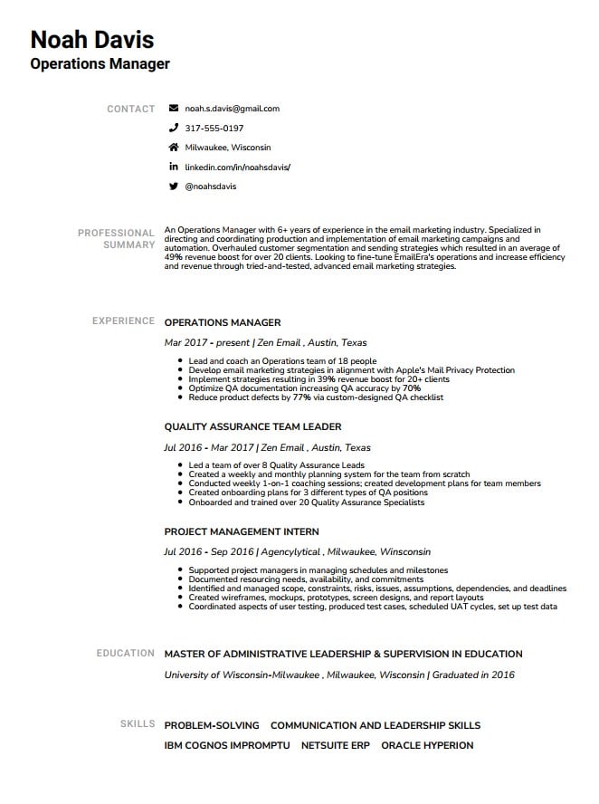
Take a look at the combination resume example below.

Sections to include with a combination resume format
This resume format includes 2 different skill-related sections. Here’s what to include and in which order:
1. Contact information
Your name, email address, phone number, location, LinkedIn URL, and optionally other information such as a blog, portfolio, relevant social media, and similar. (Don’t add your photo and date of birth!)
2. Skills summary
Again, this is the key section using the combination resume format. List the crucial skills that have shaped you into the professional that you are today and that will help you nail your new job on a day-to-day basis. Don’t forget to include quantitative/qualitative proof of the great work you did with those skills, don’t just theorize about them without evidence to support it.
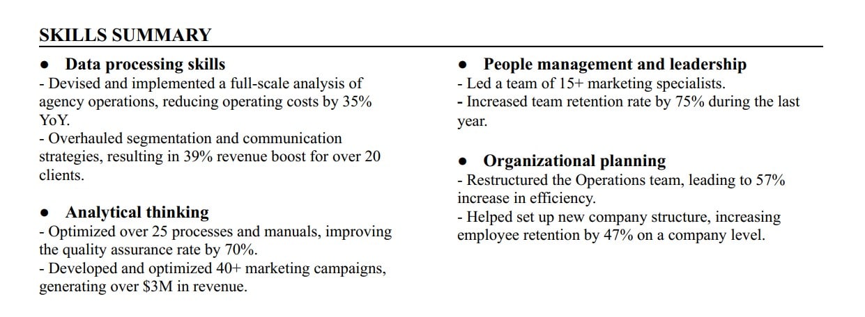
3. Additional skill sets
Here, you’re adding complementary skills. These can be additional, but less relevant hard skills important for the position, or complementary soft skills that will seal the deal and make you the perfect candidate.
You don’t need to be as detailed here as in the Skills summary section.

4. Work experience
Keep it short and sweet, list your positions in reverse chronological order and format it like this:
- Job title, company name, and location
- Employment dates
- Main responsibilities (in bullet points and make sure you list key achievements, both qualitative and quantitative). If you don’t have relevant work experience, don’t opt for this resume format.
5. Education
Same as with any other resume format. The highest degree of education you’ve completed at the top, followed by previous ones. If you have a bachelor’s, skip high school.
When formatting this section, include:
- Your degree, field of study, and major
- University name and location
- Years attended
- GPA (only if 3.5 or higher)
- Awards and honors (if any)
Combination resume format: pros and cons
Pros:
- Focuses on both experience and skills
- Good for highly experienced candidates
Cons:
- Not convenient for the majority of candidates
- Difficult to write
How to choose the best resume format for you
Wondering which resume format might be the best for you? It’s simple.
Use the reverse chronological resume format if you’re:
- An experienced candidate with linear career progression and without employment gaps
- Mid-level professional
- Entry-level job seeker (in this case, rearrange Work Experience and Education sections)
Use the functional resume format if you’re:
- A creative worker (copywriter, designer, musician) or in any role where a portfolio matters more than a resume
- An ex-military professional transitioning to a civilian job
However, use the functional resume format at your own risk.
Finally, use the combination resume format if you’re:
- A highly experienced professional or a specialized candidate
- A career changer (with many years of experience nonetheless)
And now… let’s break down the remaining ambiguities of the phrase “resume format!”
The Basics of Resume Formatting
The resume layout, that is, your resume’s formatting, affects its appearance the most. You need to format your resume so that it’s easily scannable, clean, organized, and clutter-free. Here’s how.
Margins
For an elegant look that’s neither too empty nor too cluttered, set the margins to one inch on all sides. In case you need some extra space, there’s an option to reduce them slightly, but don’t go below ½ of an inch, otherwise your resume will look stuffy.
Fonts and font sizes
You’ll want modern and easily readable fonts such as Arial, Helvetica, Tahoma, Times New Roman, Verdana, Calibri, or Roboto. Avoid Comic Sans, Courier New, and Lucinda Console.
Pair two different fonts (one for normal text, one for headers) to stand out: for example, one Serif font and one Sans Serif font to make your resume interesting and balanced.
Use bold and italics to highlight certain parts of your resume; you can bold the headings and italicize subheadings or previous job titles and dates in a company.
As for the font size, use 11–12pt for normal text and 14–16pt for headers and section titles.
Whatever option you choose, make sure to use it consistently throughout your resume.
Line spacing
Things are fairly simple here: use a single-spaced format up to 1.5-point spacing.
Header with contact information
This is the very first section at the top of your resume.
It contains your name, email address (make sure it’s a professional one, not the one you’ve been using since high school!), phone number, location, LinkedIn URL, and other relevant information such as a blog, portfolio, relevant social media, and similar.
What’s important to remember here is that, if you’re applying for a job at an American company, you should not add your date of birth and your photo to the header with contact information. There’s really no need for recruiters and hiring managers to know what you look like, as your experience and achievements will speak for themselves. The same goes for the UK and Ireland.
However, in South America, Asia, Africa, and the Middle East, adding a photo is desirable. In Western Europe, resume photos are acceptable but gradually going out of fashion.
Visually highlighted headers
The headers are the main pointers towards key things in your resume. You need to use them carefully to direct recruiters to the stuff you want to highlight.
Make them stand out by using a different font (one font for all the headings, one font for normal text) and font size (14–16pt).
Many resume builders will let you choose between several different looks which style headers in various ways, so you can pick the one you like best.
The proper order of sections
A rule of thumb is to use the reverse chronological order format, which calls for this order of sections:
- Contact information
- Resume summary or resume objective
- Work experience
- Education
- Skills
- Additional sections (optional): certifications, volunteer work, publications, etc.
If you don’t have relevant work experience, or you’re still a student or a recent graduate, you can put education information before work experience:
- Contact information
- Resume summary or resume objective
- Education
- Work experience
- Skills
- Additional sections (optional): certifications, volunteer work, publications, etc.
If you opt for a functional resume format, this is your order of sections:
- Contact information
- Resume summary or resume objective
- Skills summary
- Work experience
- Education
- Additional sections (optional): certifications, volunteer work, publications, etc.
Finally, if you chose a combination resume format, it goes like this:
- Contact information
- Skills summary
- Additional skills set
- Work experience
- Education
- Additional sections (optional): certifications, volunteer work, publications, etc.
Bullet points
Use bullet points to list work experience and education. Don’t go above 7 bullet points per entry. Remember to focus on key achievements rather than day-to-day duties when listing work experience in bullet points.
How to format dates
When listing work experience, you can list only years when you were employed at a certain company. Alternatively, you can use months and years, but there’s no need to add days too.
When listing education, you can list years attended or only graduation year. If you wish to, you can add a month.

You can also add dates when you obtained certain certificates, completed projects, gave a lecture, and similar.
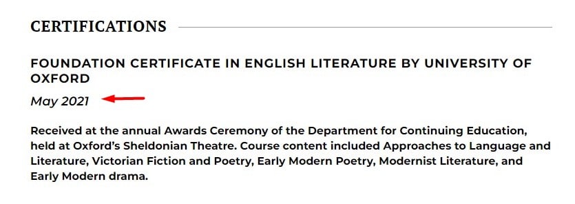
When adding months, make sure to spell them out and not use numbers (03 for March, for example). Using a number is not incorrect per se, but it might make it more difficult for ATS and recruiters to extract information.
Proper File Formats to Use for Saving Resumes
Here’s the final disambiguation of the phrase “resume format.”
Which file format should you use when saving your resume?
In short, it’s recommended to use a PDF file. It’s a safe bet, as your resume will look the same across all devices. Alternatively, you can use .docx, or another file format, if a recruiter requests it.
When saving your file, avoid random names such as “Resume_01.pdf” or “Resume_download_Mike”. Instead, list your name like this: “Mike-Davidson-Resume” or “Mike-Davidson-Operations-Manager-Resume.”
For bonus points, add the name of the company you’re applying to: “Mike-Davidson-Resume-Acme” will surely make the hiring manager feel that tiny bit more special.
FAQ: Additional Tips for a Flawlessly Formatted Resume
How long should my resume be?
Ideally, it should be a single page, especially if you have fewer than 5 years of experience and if you’re a recent graduate (or still a student).
If you’re experienced (5+ years), you can make it two pages long, but only if you feel it’s the only way to include what really matters.
The key thing to remember is that you can be detailed around positions that are relevant to the one you’re applying for; all others should not take up too much space and you can list only key things.
What’s the best file format to send my resume in?
As already mentioned, PDF. In rare cases when a recruiter asks you otherwise, you can use a .docx or .txt format, depending on what they want.
What about those super creative resume formats that go viral from time to time?
Yeah, we all remember that guy who styled his resume as a Google’s results page (he was applying to Google, you guessed it).
If you’re a highly creative person, like a graphic designer or a creative director, or similar, you might be tempted to showcase your design skills in your resume.
Still, it would be better to keep it simple. This is because you have ATS rounds to go through before a human eye looks at your resume. And even if you pass the ATS test, if your resume is too colorful it might be distracting or draw attention away from useful information.
So the best approach would be to keep it fairly simple and straightforward, and then include a link to your portfolio and showcase your genius there. 😉
What’s the best resume format in 2025?
The reverse chronological resume format is the best resume format to use in 2025. It’s the most ATS-friendly one, recruiters are familiar with it, and it’s candidate-friendly, as it lets you easily highlight your best achievements.
As a student, which resume format should I use?
Your best bet is the reverse chronological resume format with a slight twist: you can rearrange the work experience and education sections, placing education at the top, therefore highlighting your strongest points.
